Typography

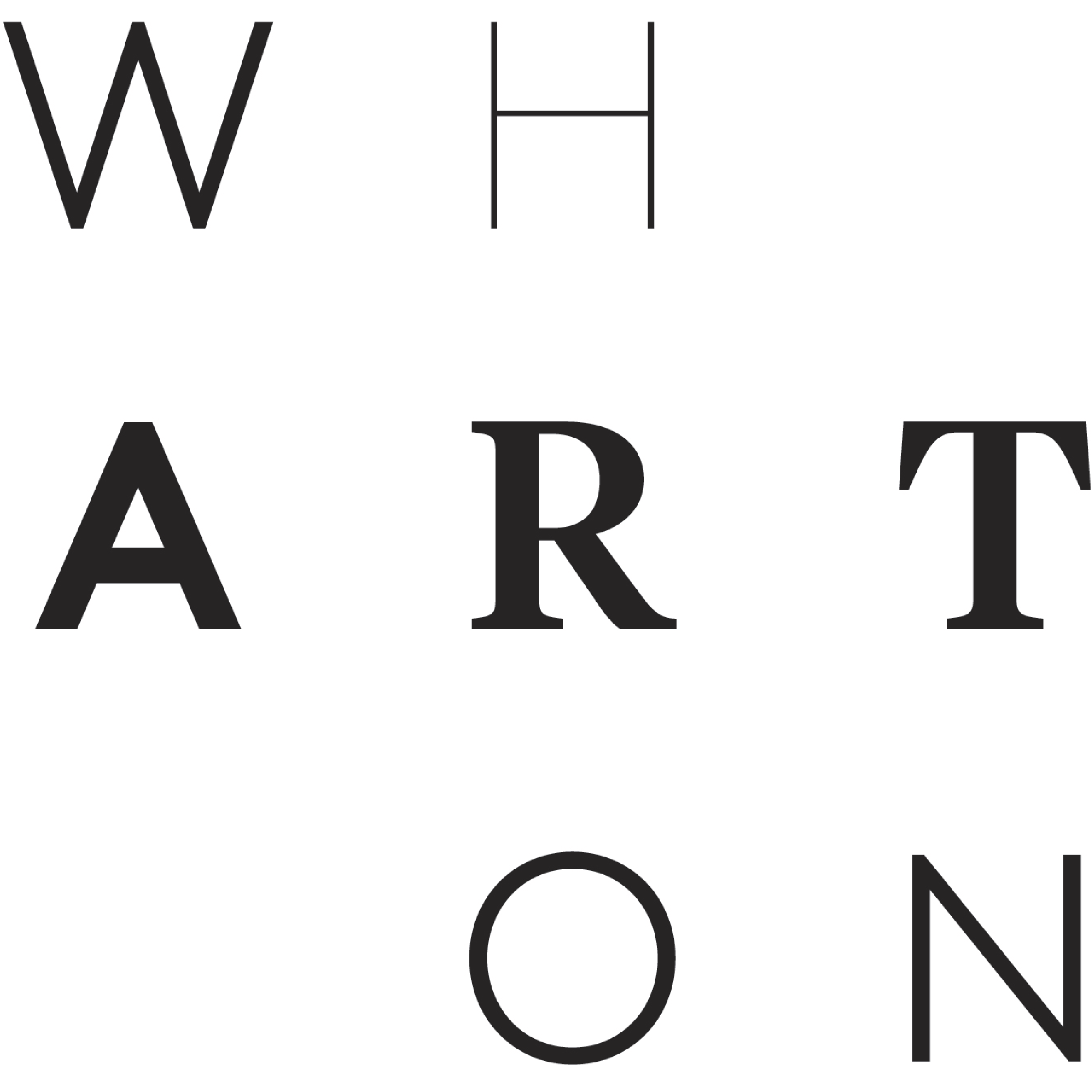
Love this brand ID that breaks Wharton into three lines to emphasize “ART” which is presented in different typefaces. Wharton Center for Performing Arts at Michigan State University.
•••
This post is an entry in Creative Toolbox • A Visual Diary where we share a daily reflection — inspiration, insight, fun fact, or tip — gleaned from our spirited journey through the worlds of communication and design.
